Schoolcomms provide a range of online systems and tools that help schools manage parental engagement.
The problem was these tools were fragmented and dispersed across a number of systems and they needed to be unified into a single, smooth and consistent user experience.
Approach
I often describe User Experience (UX) design as the ‘design behind the design’ and it’s the User Interface (UI) design that is the veneer that slots over the top.
With this concept in mind we split the project into a number of phases, the first two concentrated mainly on the UX and the final phase was purely focused on the UI.
Discovery
Knowledge gathering and analysis
Exploration
Wireframes and grey-screen prototypes
Design
UI design with fully art directed screens
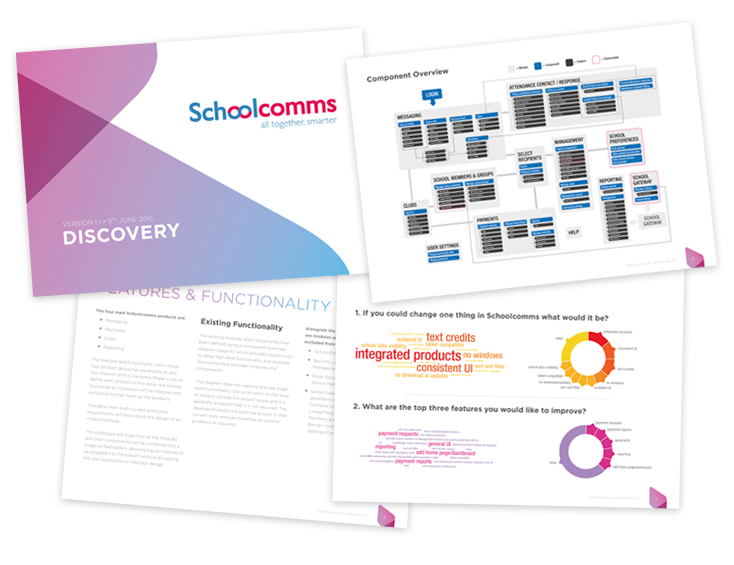
Discovery
The Discovery phase focused on knowledge gathering and analysis. Working closely within the organisation to gain a detailed insight into the business and fully understanding the scope, objectives and priorities.
The output from this phase was then formalised into a Discovery document that would define the vision, scope and business objectives of the project.
Exploration
The Exploration phase began with a detailed investigation into the processes and functions that are at the heart of each product.
One of the key aims during Exploration was to identify commonality within and between each product, mapping the pathways that a user would take to perform set tasks. This was achieved by producing wireframes and grey-screen prototypes that helped to ensure the redesigned system fully supported the complete user journey.
Design
Guided by the outputs from Discovery and Exploration, phase three finalised the UI design with fully art directed screens.
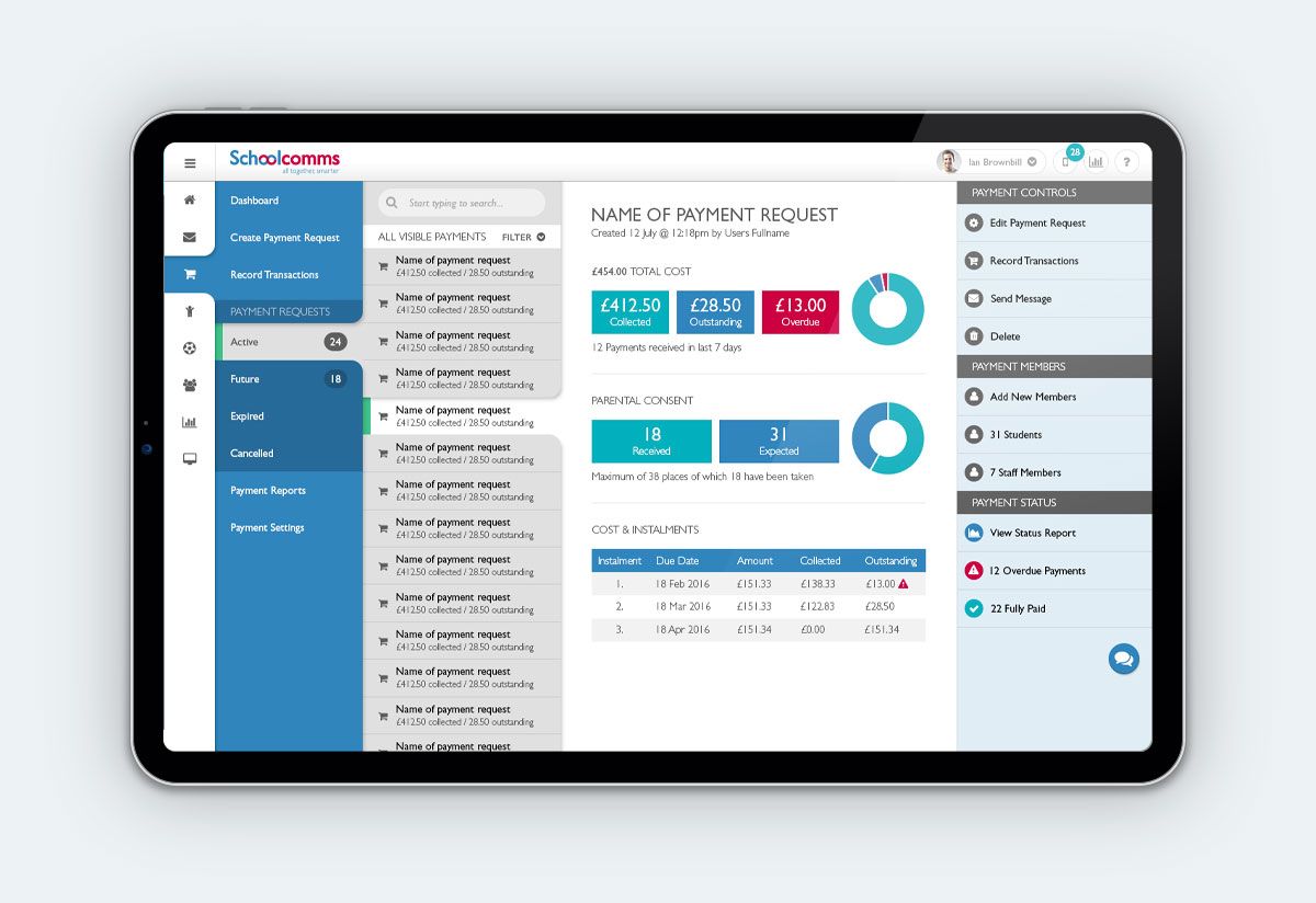
Although the primary objective of the project was to produce a single unified system, the redevelopment of the products within the system would be staged and therefore the designs focused on two elements of functionality – Messaging and Payments.
By producing fully art directed screens for both of these elements, common design patterns were identified which which were then used to expedite the design of the remaining products and all future redevelopment.
Acknowledgements
Thanks to the most excellent design contributions from Dan Smith (who also designed my logo) and Tim Jameson for recommending me to the client. Shout also goes out to Ian Brownbill (client) for the ‘right-brained thinking’ and lengthy workshops sessions in Bude which gave me the perfect excuse to go for a surf on my way home!
Intuitable is pretty much the full(ish) portfolio of Michael Palmer. Everything that you can see here is of my own work. I have been fortunate to work with some great organisations and individuals in the last 20(something) years, and their commission / contribution is noted.