At its simplest, a design pattern is a reusable solution to a design problem.
Reusable sets of design patterns allow organisations to create products that align, feel familiar, behave in the same way and operate consistently while maintaining a positive and consistent UX.
Principles can be thought of as the rules that define the “look and feel”.
Defining an over-arching set of design principles to govern the style of a digital product, allows organisations to maintain visual consistence across their entire digital portfolio.
Patterns and principles help smooth the rollout and maintenance of projects.
Having a toolbox of ready-made design components (the patterns) and styles (the principles) results in an immediate focus on solving the business needs of an organisation.
Design Patterns
A design pattern can vary in its granularity or level of detail. For example a pattern could describe at a fine granularity how buttons work or at a broader granularity how an account creation and login process should operate.
Design patterns are becoming increasingly important within the world of web and app design. From small scale projects with simple design component sheets to large scale, enterprise systems with fully documented pattern libraries, the value they bring to any project is huge.
Design Patterns were a significant part of the GPT Initiative.
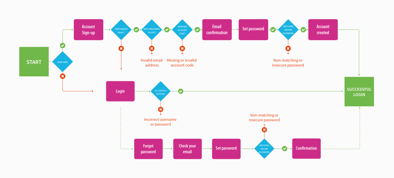
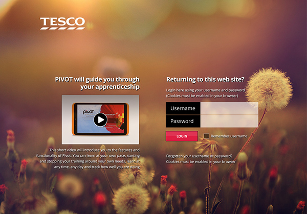
Account Creation & Login Process
Button Types & States
Design Principles
A good starting point is to think ‘Style Guide’.
For any project (tiny or huge!) you should be documenting the standard colour palettes, typography, iconography, imagery and writing styles. Not only is it a very handy reference point but it forces you to be consistent.
Extending on the basic documentation, you can also look to define the:
Layout – units and measures, metrics and keylines, layout structure and breakpoints used within your design system.
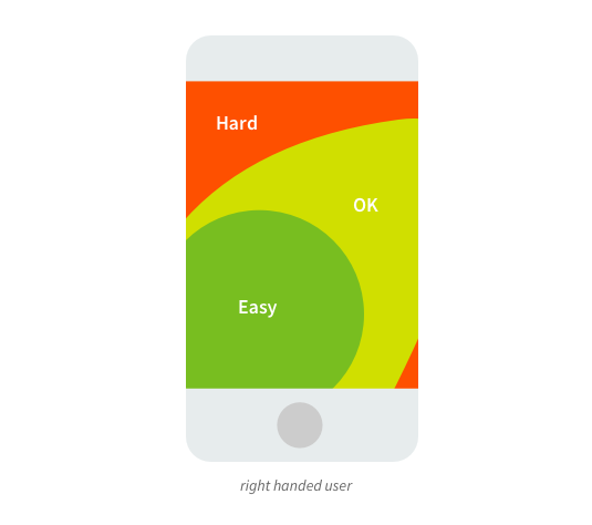
MobileConsiderations – pixel density, Retina displays, touch interactions and the thumb zone.
Accessibility Standards – expanding a product or services potential user base which is the legally and morally right-thing to do.
System Behaviours – if you standardise the look and feel then you can also standardise how a system behaves – form and function perfectly aligned.
The basics that all styles guides should cover
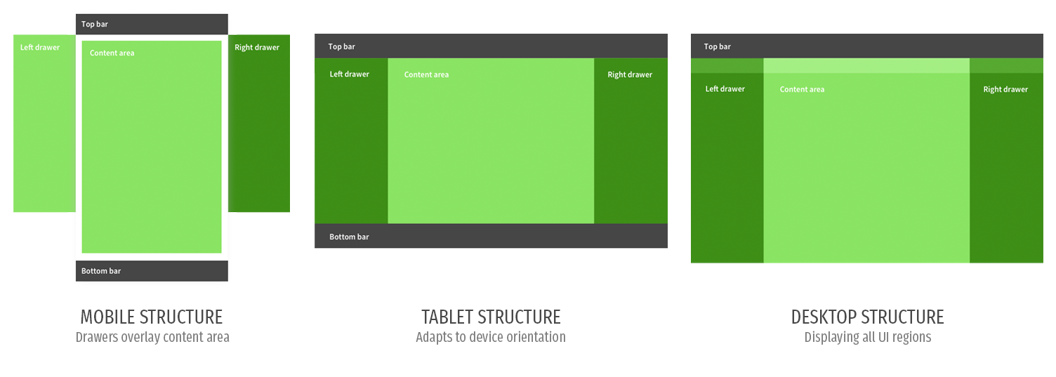
Layout structure documenting UI regions for all device types
Designing for the thumb zone makes the experience more comfortable for users
Portfolio Examples
Nearly all of my projects from 2010 onwards have some form of documented design patterns and/or principles, but some of the best are listed below.
Intuitable is pretty much the full(ish) portfolio of Michael Palmer. Everything that you can see here is of my own work. I have been fortunate to work with some great organisations and individuals in the last 20(something) years, and their commission / contribution is noted.