This is one of those projects that UX/UI designers dream of landing. Contracted via Kineo, Intuitable was given the opportunity to completely redesign the User Experience of the Wella LMS platform, taking a fully mobile-first approach to the redesign.
Objective
Wella Education provides learning materials and inspirational resources to hair stylists and salon owners across 21 country/language versions, each with its own translated and location-specific content.
The majority of learners access the platform via their smartphones therefore the key objective for the redesign was to take a mobile-first approach to create a fully responsive, multi-language solution that gave individuals of varying learning styles and experience the knowledge they need to succeed.
Challenge
During the initial Discovery Phase of the project, a full review of the existing platform was conducted which identified a number of issues that needed to be addressed.
The mobile experience could be significantly improved and it was difficult to navigate through content as the original design of the site was driven by the various Coty brands, which resulted in a confused user experience. Functionality could also be simplified and the design made more consistent with clear calls-to-action.
Simplification
Our approach was to simplify the presentation of the content and the mechanics of the user-facing functionality. Wella Education has a large number of unique visitors (400,000+) so it was critical to create rapid prototypes of the new system and conduct user-testing to validate our assumptions and ensure we got things right.
To achieve all this we relied heavily on the speed and efficiency of SketchApp to create our screen design and InVision to rapidly produce functional prototypes for user testing.
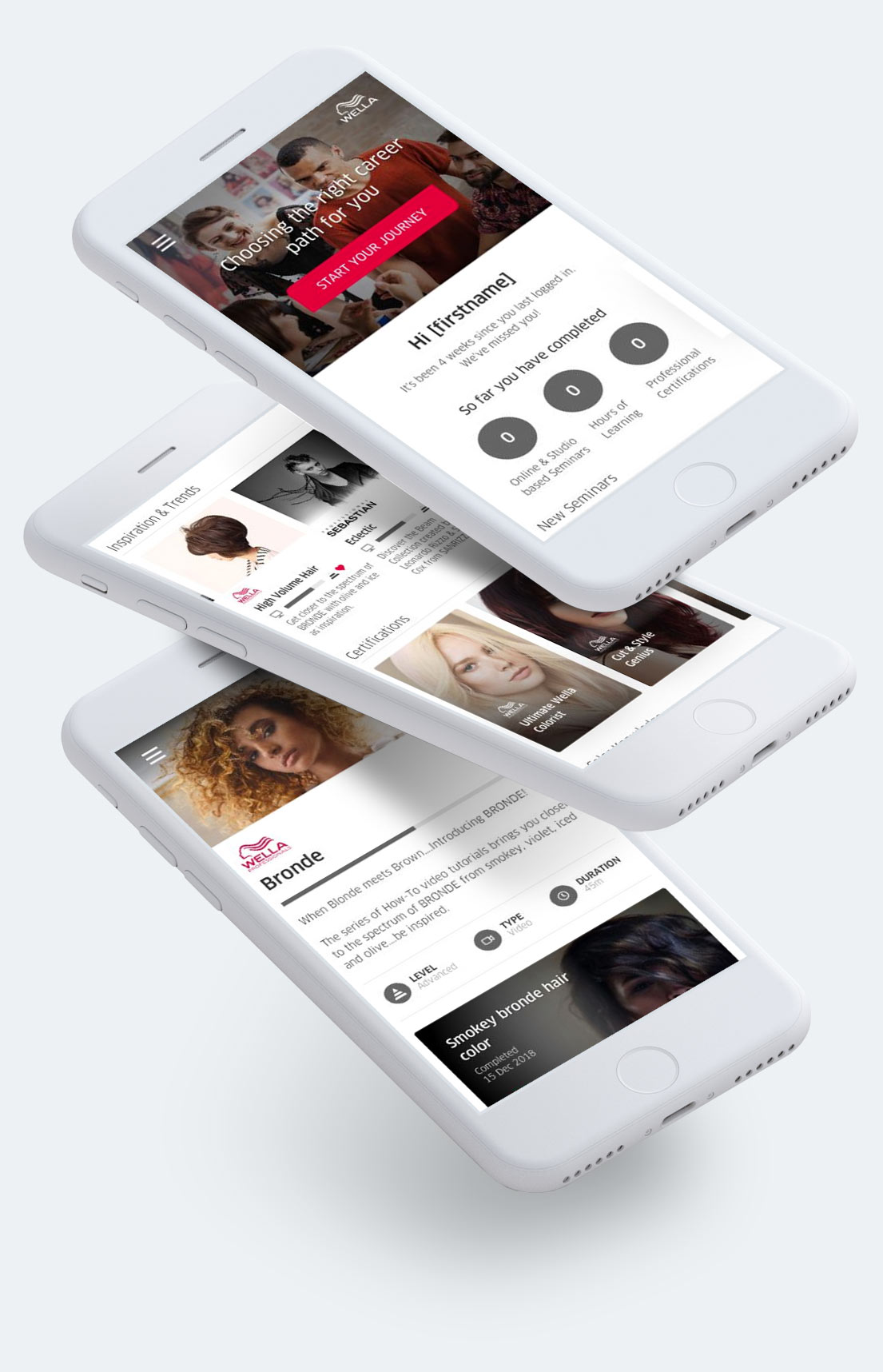
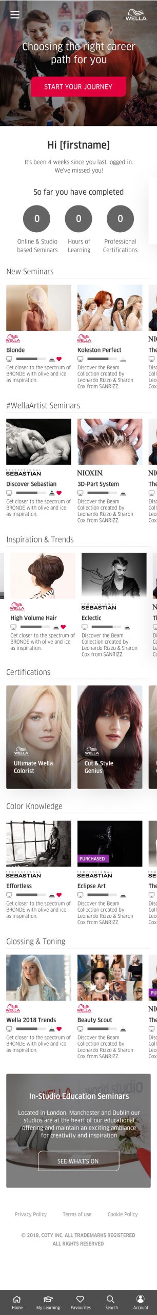
Mobile First
Re-imagined and re-designed, the site took inspiration from the likes of Netflix and Amazon Prime Video with categorised, horizontal scrolling, learning content.
The UI colours, style, typography and branding were deliberately kept subtle to lend weight and prominence to the high-quality photography used throughout.
Information displayed for each element of content is intended to capture the users interest while providing meta information for content type, level and/or status.
Clear progress indicators are provided as well as the expected time it would take to complete each module.
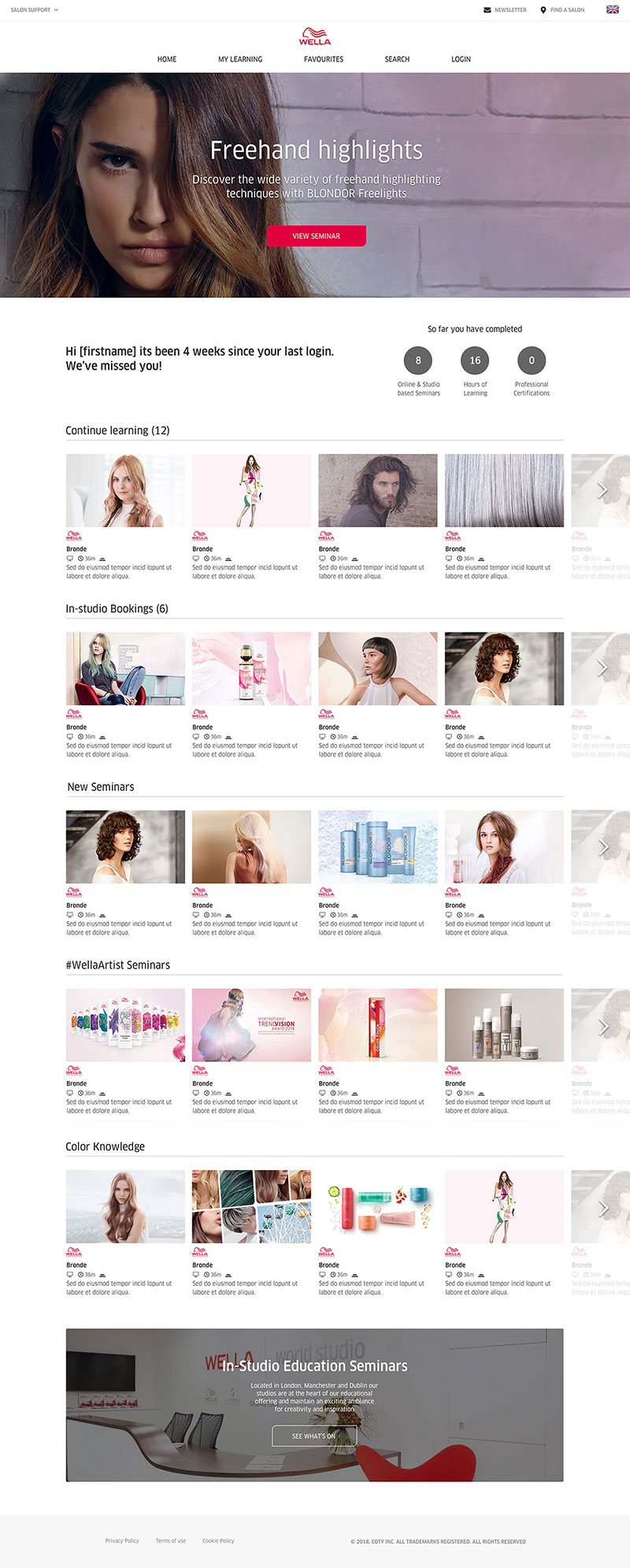
Desktop & Tablet
Although the design focused primarily on a ‘mobile-first’ approach, full attention was given to desktop and tablet screen designs, adapting and scaling the user interface to maximise the user experience across all devices.
The end results are clear to the success of this project with Wella Education now rating as the number one marketing opt-in contributor for Wella, providing 4.5% more opt-ins than wella.com
Style Guide
Once the designs were finished our involvement in this project came to end. But to ensure the development team had everything they needed (and thanks to the power of Sketch) we were able to quickly create a style guide sheet containing all the components and styles used within the designs.
Acknowledgements
Big thanks go to a great, forward thinking client at Wella, Kineo and all the team there for inviting me to work on this project (especially Lucy Deacon for some fearless PM’ing!) and of course Paul Messenger for helping with the designs, his attention to detail and endless patience
Intuitable is pretty much the full(ish) portfolio of Michael Palmer. Everything that you can see here is of my own work. I have been fortunate to work with some great organisations and individuals in the last 20(something) years, and their commission / contribution is noted.