The design of the Totara Mobile app was more than just the way it looked, it was about how the complete system worked and the entire end-user user experience.
User Interface
The goals of the UI were for simplicity, clarity and efficiency without unnecessary clutter. The UI design aimed to represent these goals with a coherent structure that was applied consistently across the entire system.
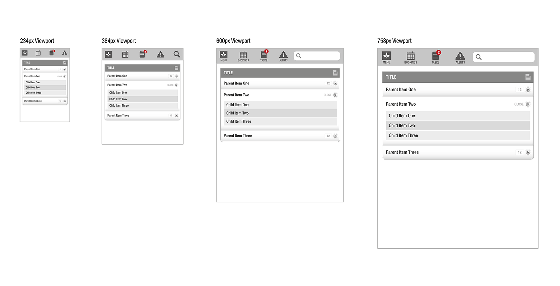
Each set of wireframes shows the varying layouts for the main viewport breakpoint sizes of 234px, 384px, 600px and 758px (these were relevant at the time but are now somewhat outdated!).
The customisable short-cut menu bar along the top of app provided quick access to the primary sections and could show highlights of the number of items that require attention.
Main Menu
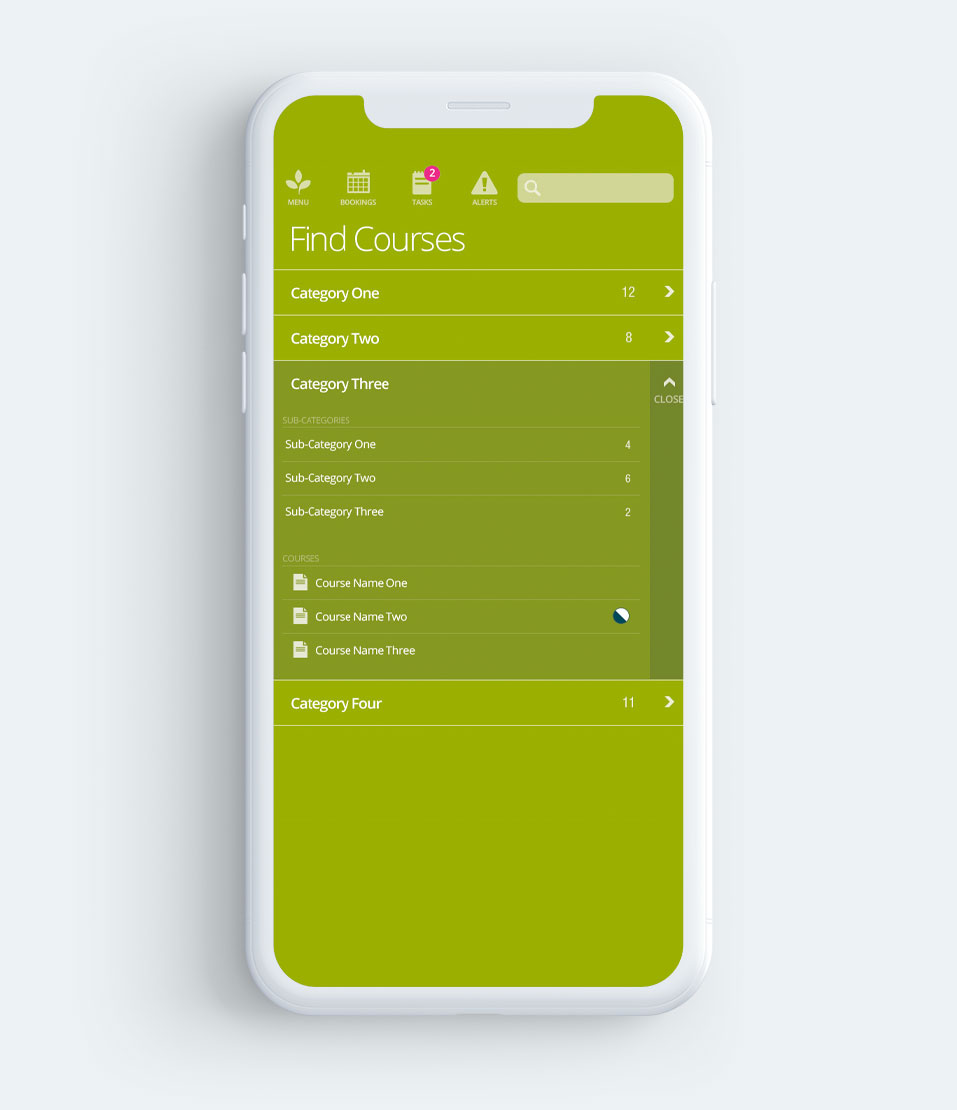
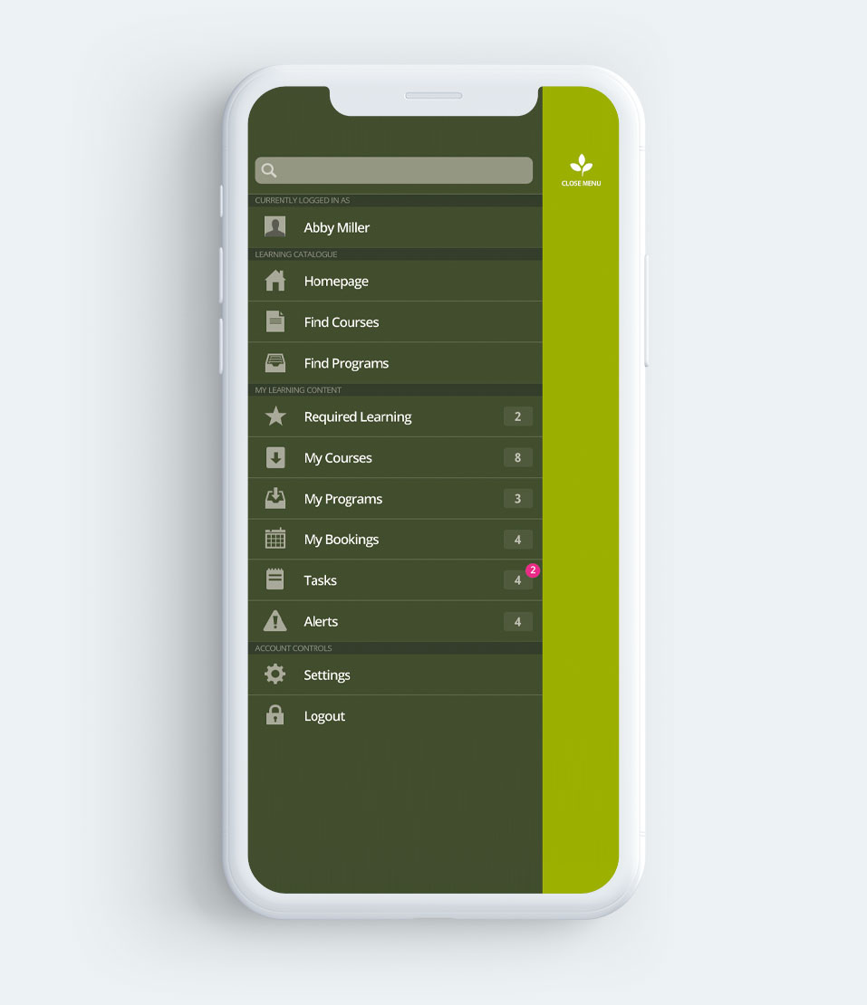
The main menu provided quick access to all navigation options and controls.
Options for find courses and find programs are displayed with an indication of the number of course and programs that each section contains.
Options for required learning, my courses, my programs, my bookings, tasks and alerts show an indication of the number items within each section and highlights the number of items that require attention.
Setting options can be used to edit existing stored logins.
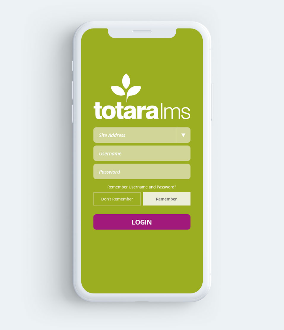
Login
Login screen provided the opportunity for discreet branding.
The elect box on site address would allow users to choose from existing/stored login details (i.e. multiple LMS accounts).
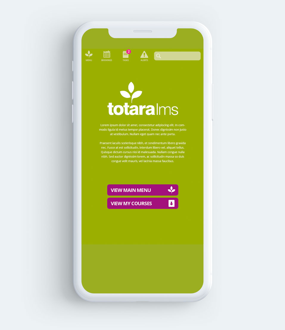
Homepage
Homepage provides options for client branding alongside a plain text description.
View main menu button is provided to help introduce the user to the navigation within the application.
View my learning button is provided to quickly direct users to their learning content.
Additional buttons can be configured to display on this page as required.
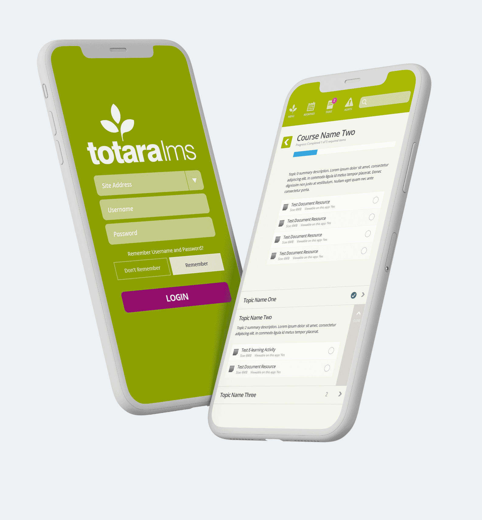
Course Summary
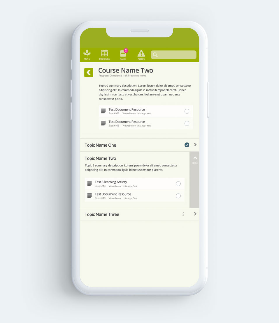
The course name is displayed with progress indication and a return arrow icon takes the user back to the previously viewed screen.
Dates have been removed from the display as there is potential confusion for users. The topic summary description is taken from Topic 0 within the course (the very first topic section) and the 600px Viewport illustrates Topic 0 that has activities/resources.
When collapsed, topics are presented with an indication of the number of items (activities/resources) within. Expanding a topic removes the number indication and replaces it with a close label.
Once expanded the topic summary description and all activities/ resources are shown with an indication of progress, file size and any other associated information.
E-learning Activity
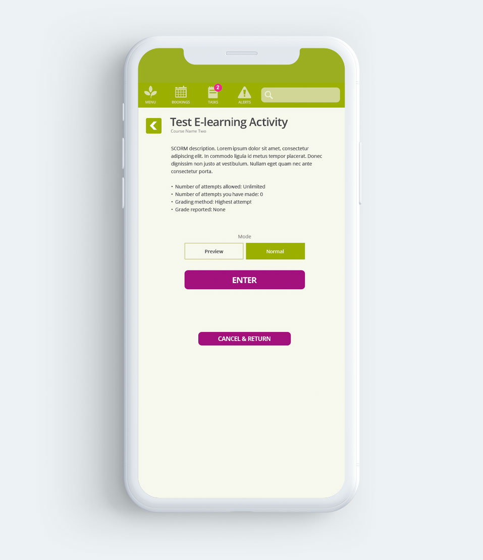
The return arrow icon takes the user back to the previously viewed screen to keep consistency throughout the mobile app.
The e-learning object description and attempts data is displayed with options to launch in preview or normal mode.
Enter button launches the e-learning object. Cancel and return button takes the user back to the course page.
Acknowledgements
Thanks to Kineo for the commission and Sven Laux for temping me with this project over the summer of 2013
Intuitable is pretty much the full(ish) portfolio of Michael Palmer. Everything that you can see here is of my own work. I have been fortunate to work with some great organisations and individuals in the last 20(something) years, and their commission / contribution is noted.


